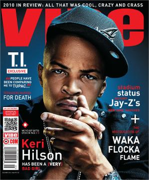
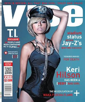
I have examples of front covers from Vibe magazine that I want to use and get ideas from to create my own magazine. I want to use similar colour schemes for my magazine and use the overlay on my masthead to create a 3D and more professional looking magazine. I aim to use a similar body posture to the Keri Hilson front cover and the simplicity layout of the texts. The plus symbols would add a sophisticated and effective look to my front cover.
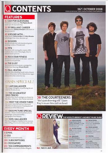
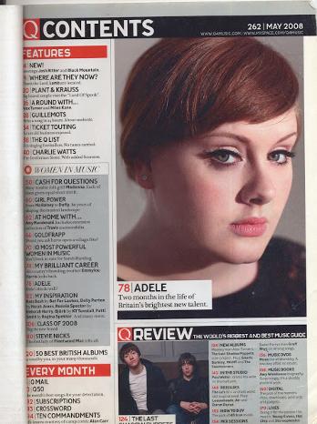
These are examples of Q magazines contents page where I aim to use a similar layout and colour scheme. It gives a sophisticated and simple look to the magazine.

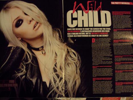
I want to use layouts similar to these for my double page spread which looks sophisticated. I aim to use similar layouts of both double page spreads and use the colour coordinations of the Wild Child double page spread and a similar typography to the NME 'USA' double page spread.